Transforming the Production Switcher Interface

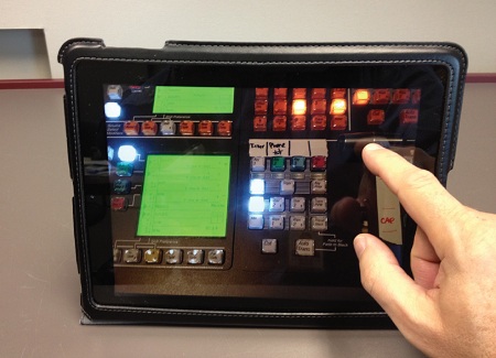
iSwitcher... coming soon? JOHNSTON, IOWA—It appears to me that there is a bit of a war going on in the production switcher world—not between manufacturers but between the user interface and the underlying technology. Anyone who has installed software in the default mode quickly recognizes that the favored user interface is a touchscreen on a tablet, not a keyboard and a mouse. The use of the old interface really inhibits the natural workflow that the software is designed for. I suspect that this is happening in production switchers and is probably the driving force behind the interest in production automation.
The first time I worked with a production switcher was as a student at Loyola Marymount University in California. As a communications arts student and a bit of a “gear head,” I really enjoyed tinkering and playing with the technology so I often ended up being a technical director on student projects. LMU had what at the time was one of the topof- the-line Grass Valley Group switchers that in addition to fades and cuts had Chroma key capabilities and a wipe generator subpanel that was programmable from under the work surface through the manipulation of a matrix of little silver toggle switches. Most of the other student TD’s had no clue that the control panel could be opened let alone that there were subcontrols available. I remember doing an offset saw tooth oscillating wipe to a camera shooting crumpled aluminum foil lit with red and yellow lights to simulate flames. It was an idea that I got from seeing the film “Krakatoa, East of Java” which was nominated for an Academy Award for “Best Visual Effects.” Sadly, red- and yellow-lit foil on a conveyor to simulate flowing viewed on a giant screen at the Cinerama Dome in Hollywood didn’t work as well as my oscillating wipe when viewed on a small color television monitor.
INCREMENTAL GROWTH
The capabilities within a production switcher have increased with each subsequent generation. Multiple effects buses, infinite re-entry, and layers of keying (both Chroma and luminance) per bus grew even in the old analog days. While working for KHON (then a NBC affiliate) in Honolulu, I remember watching TD’s on programs pushing four and five buttons simultaneously to move from one shot to the next complex shot. It was not unusual on a live show to see one of the keys come in late. This was a classic example of where the capabilities of the switcher electronics exceeded the capabilities of the user interface, the control surface. I began research at KHON to replace their aging GVG 1600 switcher with something newer like the GVG 200 which had E-MEM that allowed for the storing of complex setups. I unfortunately left KHON before they retooled but I took my research and applied it at WSAZ in Huntington, W.Va.
During the rebuild here at IPTV, the production switcher research took a great deal of time and effort. It was my first foray into replacing a production switcher in almost 10 years and I was amazed at the capabilities that were standard features within the units. Now they included 3D visual effects, still stores, and more power in a single bus than was in a fully loaded GVG 300, which was the yardstick by which production switchers were measured. The E-MEM system for managing these complex systems had also grown to include interfaces with external devices allowing for extraordinarily complex setups and transitions. In addition, the underlying infrastructures are now software-based so substantial changes in capabilities can happen via software update with no change in the hardware. So there is this incredible increase in the capabilities and potential of the switcher and yet the user interface is substantially the same except for some minor evolutionary changes.
THINK OF THE CUSTOMER
Now before the switcher control panel becomes a huge touchscreen, we do need to think long and hard about the end users.
I was an early adopter of computers. I wrote code in machine language using a punchcards and a light reader. I have programmed mainframes in Focal, Fortran and Cobol. I liked working with DOS and I still run some things from the CMD window. When I was asked to try out Microsoft Windows along with products like DESQView and a couple of other user friendly multitasking environments, I remember being bitterly disappointed in their performance. They certainly were not user friendly or intuitive to those of us that were comfortable working with a blank monitor and a blinking cursor. The mouse took awhile to get used to and for quite some time I continued to use a trackball because it was more accurate for the type of work I did. So I don’t expect established TD’s will welcome a major overhaul of the basic switcher control surface with open arms. There will have to be demonstrable benefits that are important to them in order to make the fundamental change. I remember being at an NAB Show in the early 1980’s watching a switcher demonstration from a European manufacturer. While the switcher performed flawlessly through the demo, none of the American TD’s were comfortable operating it. Why? The fader bars moved over a raised semicircle on the control surface rather than linearly along the flat surface they were used to. It may seem meaningless to the nonusers but I would point out that I have never been in a facility in the United States that uses a vision mixer with raised fader bars.
Bill Hayes is the director of engineering for Iowa Public Television. He can be reached via TV Technology.
Get the TV Tech Newsletter
The professional video industry's #1 source for news, trends and product and tech information. Sign up below.
