What Does Good Lighting Have in Common With Renaissance Paintings?
Whether a video screen or artist's canvas, the display surface is limited to two dimensions

It might surprise you to know that lighting for television has a lot in common with Renaissance painting—not necessarily the subject matter, but in the limitations of how the work is displayed on a flat surface. We perceive the world through binocular vision. Two overlapping fields of view allow us to perceive depth and shape.
But when you photograph an image, you’re using a single lens, rather than two eyes. Our sensation of depth, called stereopsis, disappears when an image is captured by only a single “eye.” In fact, one method that I use to gauge how a shot will look to the camera is to cover one eye while viewing it.
That’s how a camera sees—one-eyed.
Our display technology is likewise limited because it’s flat. Whether it’s a video screen or an artist’s canvas, the final display surface is limited to two dimensions. In that respect, we face the same limitations as the Renaissance artist: How to effectively portray three-dimensions using a two-dimensional medium.
Long before the advent of film or video, artists struggled to create images of depth and vibrance in a flat medium. Dealing with the two dimensions of their canvases, they recognized that there were visual “cues” that signal depth to us, independent of binocular vision. Chief among these visual cues is shading.

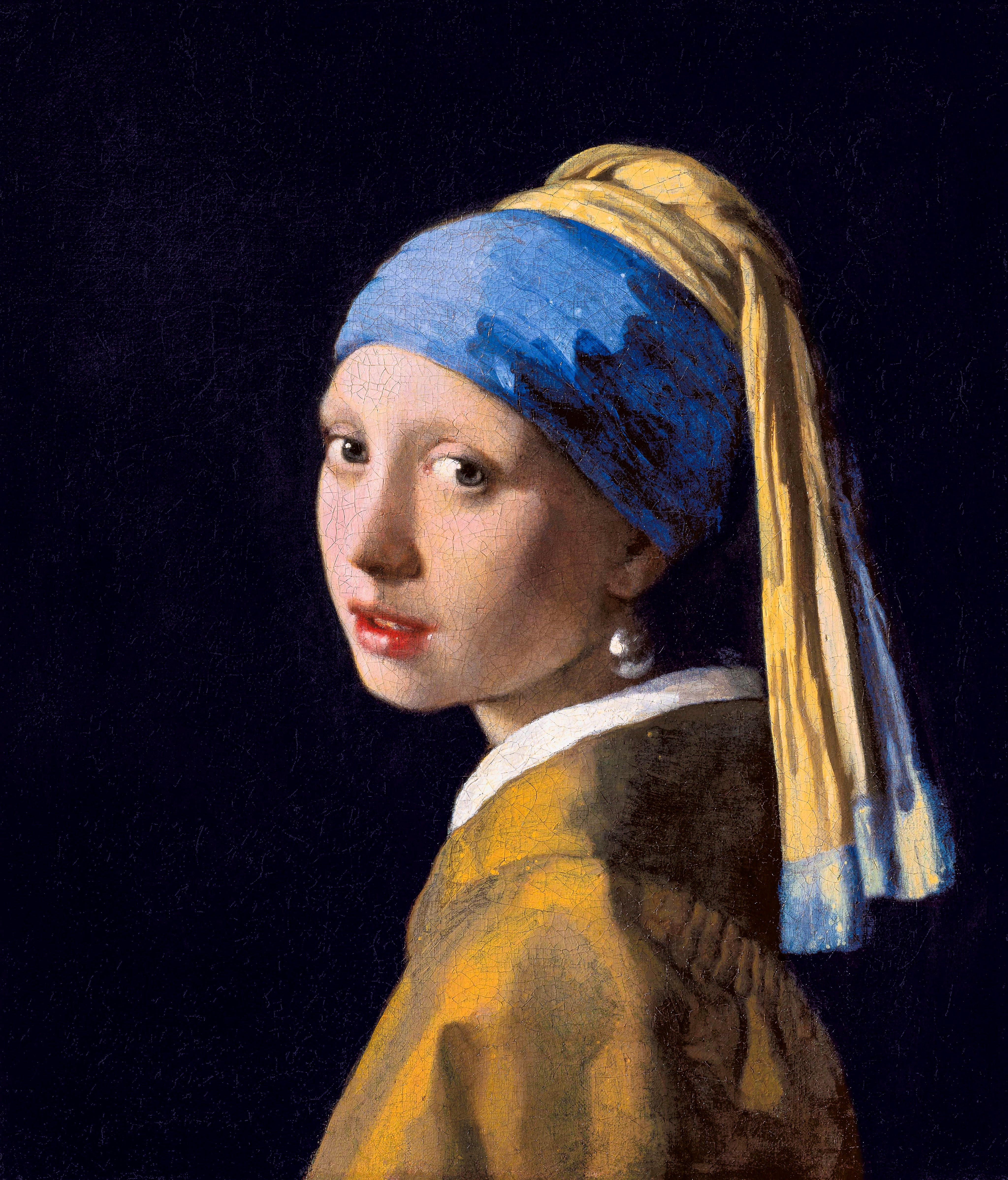
“Shadow is the means by which bodies display their form,” Leonardo da Vinci said. All shape is clothed in subtle shades of shadow and light. The art term “chiaroscuro” describes the use of light and shadow to give shape to three-dimensional objects. Another term we use for this is “modeling.”
Highlights and shadows define the shapes of things and are able to do so independently of binocular vision. That’s how we create the illusion of shape, without the benefit of actual depth on a flat display.
Leonard da Vinci
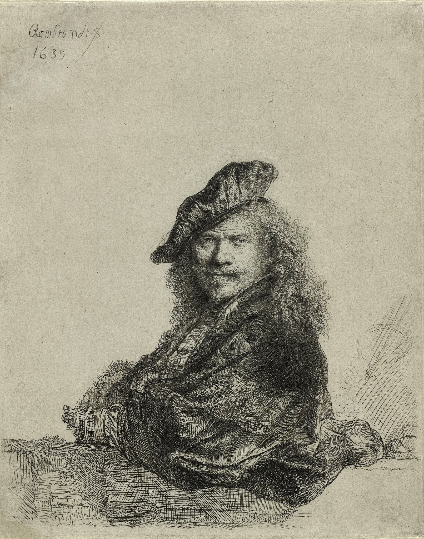
Research has suggested that one reason Leonardo da Vinci was an exceptional innovator in realistic drawing was due to the unusual way he saw things. It’s thought that his eyes didn’t quite align, which denied him the full use of binocular vision. Based on his self-portraits, da Vinci is thought to have had "exotropia," which is a type of eye misalignment in which one eye turns outward.
Rembrandt appears to have had a similar eye problem, based on his self-portraits. An alternate theory suggests that both artists may have had one overly dominant eye, with the same results.
Whatever the case, they would have seen a more monocular view of the world, lacking the stereopsis that provides depth perception. They would have seen things much as a single camera lens would—flattened, except for shading. Developing an alternate way to render depth was essential for them, as an adaptation to their unique way of seeing the world. Their visual quirks ended up illuminating all realistic painting today.
This defect made them more sensitive to the other visual cues that represent depth, such as shading and perspective. I don’t think that it’s a coincidence that one of the great early television lighting directors and educators, Imero Fiorentino, also lacked binocular vision. Fiorentino lost the use of an eye in an accident.
What could have been a handicap in a highly visual field forced him to be more acutely aware of how contrast defined shapes in the two-dimensional medium of television. Fiorentino didn’t advertise that he was blind in one eye. Perhaps he assumed that his clients might be less likely to hire a half-blind lighting guy.
In retrospect, he could have boasted that such “limitations” actually improved on his considerable talent for lighting, as they had helped Leonardo and Rembrandt in their art.
We may not set out to create a masterpiece on the order of da Vinci, but we are trying to create images that will connect with our audience from their two-dimensional screens. In this effort, the shading techniques of the old masters are there for us to use in the contrasting brushstrokes of light and shadow.
If All the World's a Stage, I Want Better Lighting
Most of the lighting that we do in studios and on location is designed to create a plausible place that we might find around the corner: Realistic, but enhanced to look good on camera. Interesting enough to hold the audience, without distracting it. At a minimum, we need to provide enough illumination for the cameras to “see.”

Going further, we can create lighting that establishes the appropriate setting and mood. And, of course, render the faces of the actors/participants in pleasing and appropriate ways.
Once again, the fundamental tools of light and shadow build all of that. Whether we call it chiaroscuro or modeling, it describes the same thing. Three-Point-Lighting is an offshoot with the same goal. It’s the creation of contrasting layers to define shape and impart a sense of depth.
Modeled Lighting Reveals Form
One of the reasons that I’m writing about lighting within an historical context is to open a conversation that goes beyond hardware. Lighting is more than just turning on lights. It’s the creation of plausible spaces out of two-dimensional screens that represent the fleshed-out world of three dimensions.
With the production changes brought about by the pandemic, we seem to have stumbled into a period where haphazard illumination and ring-lights are deemed “good enough for TV.”
It shouldn’t be.
Special guests and regular on-air contributors may be reporting from home, but they’re not in the trenches. Elevating the quality of those shots is an easy reach. And while every location doesn’t have to aspire to the level of great art, we can at least make pleasing images that permit people to tell their tales without the distraction of indiscriminate lighting and confusing shadows.
Toward that end, I hope you’ll join me in future columns as we look at ways to present your shows in a better light.
Get the TV Tech Newsletter
The professional video industry's #1 source for news, trends and product and tech information. Sign up below.
Bruce Aleksander is a lighting designer accomplished in multi-camera Television Production with distinguished awards in Lighting Design and videography. Adept and well-organized to deliver a multi-disciplined approach, yielding creative solutions to difficult problems.

