A Spectrum of Color Temperatures
Understanding color temperature is not a daunting task. What can be intimidating is being on location and needing to deal with a range of different temperatures at once. The camera can only be set to a single Kelvin reading at a time as its white balance, so how do we deal with different colored lights?
To review, and despite our quickly evolving lighting technology, we still speak in two main color temperatures—tungsten (3200°K) and daylight (5500°K). The lower the number on the Kelvin scale, the warmer; and the higher the number, the cooler. Obviously when shooting on film, which a lot of us do, we are choosing between these two color temperatures in terms of our film stock. With digital, which the examples in this article reflect, we have the ease of dialing in our white balance to whatever reading we choose. However, you still only have that one base number set on the camera, so you have to build around that white balance.
The first and most common example that comes to mind when needing to make some very specific color choices is night. Whether it is night exterior or night interior, the cinematographer is faced with juggling a spectrum of colors.
MOONLIGHT, YES OR NO
Typically, the first decision you have to make with night exteriors is whether or not there is going to be moonlight. If there is moonlight, what color is it? There are varying opinions on what moonlight should look like in order to emulate realistic moonlight, but it has appeared differently in quality, color and intensity since the beginning of cinema, so it’s up to the cinematographer.
There doesn’t even have to be moonlight. When it comes to mixing color temperatures, you want to base the camera’s white balance on the ambient light in the space. If that ambient light is moonlight and your moonlight is bluer, then balancing closer to daylight is wise. If you’re inside for a night interior and your ambience is tungsten lamps with a little moonlight spilling in a window, then balancing closer to tungsten is the way to go. This minimizes the amount of units you have to tweak to avoid any over-saturation with particular colors.
I find myself, as many do, shooting night scenes in the mid 4000s to further balance between warmer and cooler sources. This saves from having to convert or correct any of the units too much with gels. The green-magenta axis is not helped, however, so that is something that will need constant attention and correction, especially if you’re on location using sources that are built into the space.
With newer LED lights, you can easily dial in color temperature and tint to find the sweet spot when faced with balancing many color temperatures. If you have something like HMIs coming in through a window however, you will need to rely on gels to correct. Alternatively, you could set the base color around those units that are not as easy to correct. Then you could go around to the other lights you are using such as LEDs and simply dial in the color output.
STREETLIGHTS AND NEON SIGNS
Another example is using bold colors in a scene to represent a streetlight, neon sign, etc. It is always important to choose a base color temperature in any situation. Depending on your base, whether tungsten, daylight or somewhere in-between, different colors can appear slightly different. You will want to preview whatever LUT you are using on monitor and/or use a color meter to really dial in these bolder colors that are far away from your base color temperature.
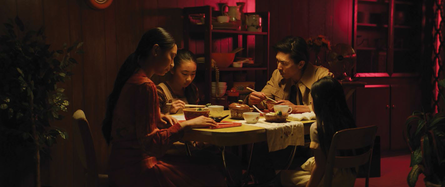
In the film “Windfall,” we had many units like ARRI Skypanels so we could choose specific colors. In a dinner scene that was set in an apartment in 1970s San Francisco, we threw purple in as a background light to add some separation and had a Jemball with a tungsten bulb over the table as our base, with the camera set to 3200°K. Throughout the project, I set mainly tungsten on the camera and used that as my base when lighting scenes. As a result, cooler sources like blue and purple really read boldly and contrasted beautifully with warmer units.

The point of this is that mixing color temperatures in a scene should not feel intimidating, rather, it should be seen as an opportunity to create depth, visual interest and visual tension. Differences in color can break up a space, separate subjects from the background and create tone. Having a singular color in a space can flatten it out. These are all choices, but it is important to keep in mind all the possibilities and techniques that mixing colors brings with it. It can make every image much more dynamic. With evolving lighting technology that is becoming more and more sophisticated and color accurate, we can more easily choose and balance color. It has become a very easy, accurate process that can really enhance the narrative.
Julia Swain is a cinematographer based in California, whose narrative films include “Killing Animals,” “Jilted” and “Cassidy Red.” She continues to shoot on a variety of formats, seeking to create compelling visuals for every story and brand. She can be contacted throughTV Technology.
Top picture: Tungsten ambience on a night interior for the film “Down to Nothing”
Get the TV Tech Newsletter
The professional video industry's #1 source for news, trends and product and tech information. Sign up below.
