Consistency in Lighting
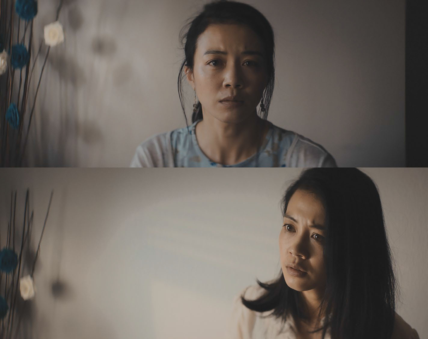
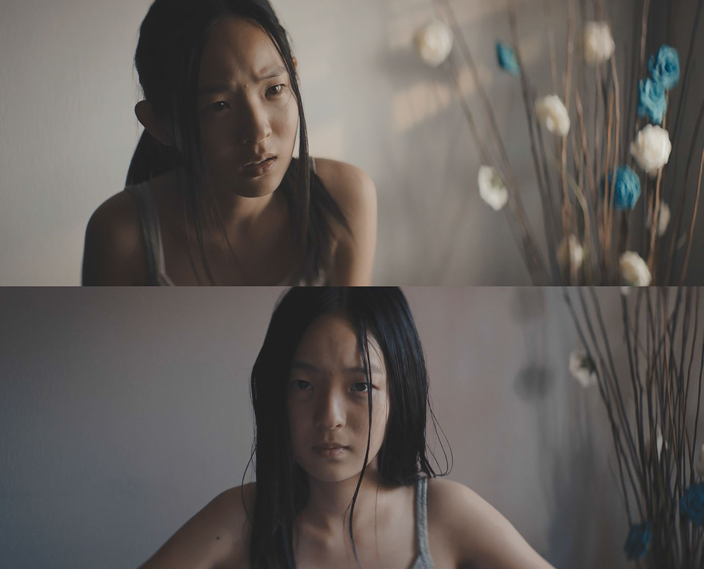
My friend Ryan Jow is someone I love shooting narrative for because he’s a director who knows what he wants and is so connected to the material. He recently brought a short film to me that had two central characters who we essentially had to shoot a lot of coverage for in a small space. Photographically, he did not want them to be in the same frame very often so we had to shoot separate shots for each and match them carefully throughout the day.

The first step for a small project like this in a confined space is choosing your tools carefully. I think being specific comes with experience because you know exactly what each unit gives you in terms of quality and intensity. You are able to nail down your lighting and grip list without going over budget because you can plan for what you need.
In this instance, both characters were at a table against a window. My gaffer and I chose smaller HMI lights—1200W and 1600W—to key with as we didn’t have the space to put them very far from the window itself. I tried to block shoot as much as I could, but the scenes escalated script-wise for the actors and it was sometimes better to break it up by scene as opposed to by each side of the room. We made note of the distance and angle of each of the lights for consistency. We also kept an eye on color and matched to what the natural daylight was doing from the window.
In the film, the day goes into evening and ends at dawn. Each table scene had a different look so I had to plan out what each look entailed in terms of units I used.
For afternoon, HMIs pushed and were a little harsher of a side light through the window; while a LiteMat 4 served as a wrappier eyelight on the inside of the room next to camera. To imitate sunset, we added warmth to the HMIs in the form of CTO and we softened a bit. We also added a tungsten Leko to rake the back of the wall behind the actresses. For the dawn look, we softened the HMIs even more significantly and made them come from more of the side as opposed to wrapping around the front of each actress’ face. I believe we also cooled them off a bit. We watched our fill level as well.

Obviously you want to maintain your lighting ratio regardless throughout any scene you’re shooting. The earlier scenes had less fill as we let our sources be harder, whereas the dawn scene was softer overall and the light spread in the room a bit, creating more natural fill light.
During the short moments when we saw both actresses against the window, we made sure to wrap our HMIs by cross-keying them to avoid them being too silhouetted. If we didn’t see enough of their faces in profile, it would be jarring to then cut to their faces more frontally where the light all of a sudden wrapped more. It wasn’t just about faces though—maintaining the same quality on the walls and objects in the frame was important as well.
When you’re shooting coverage, inconsistencies in the quality and angles of the lighting can throw off your audience and it begins to feel like actors are in different spaces. There are obviously some things, even in the biggest movies, that are inconsistent if you look closely—the most common is a wide shot with a beautiful, hard backlight that cuts in to coverage where all of a sudden that hard backlight is softened.
You learn to let things go and sweeten the close-ups. However, a cinematographer’s job is to be able to shoot around a room and maintain a look. In addition to camera and lighting notes, I would highly recommended having your DIT AirDrop you screengrabs as the day goes on so you can be referencing previous frames.
Being consistent in your lighting, in both the tools and the techniques for a project, allows you to connect spaces visually. Becoming good at maintaining a look as you move the camera around a scene then gets you to a place where you learn how to break some rules. You can keep your audience immersed in the world of your film, but still tweak lights as you move in, etc., to the point where no one notices. You can fake afternoon for sunset and keep it that way, or night for day for example, because you understand how your tools work and where to put them.
Julia Swain is a cinematographer based in California, whose narrative films include “Killing Animals,” “Jilted” and “Cassidy Red.” She continues to shoot on a variety of formats, seeking to create compelling visuals for every story and brand. She can be contacted throughTV Technology.
Get the TV Tech Newsletter
The professional video industry's #1 source for news, trends and product and tech information. Sign up below.
