Lighting the Scene From Different Directions
Getting your key light just right can get complicated when considering the blocking of the actors, the space and what units you have at your disposal. It is also easy to feel a bit of pressure when keying actors for tight eyelines and close-ups because we tend to sweeten up the lighting a bit when we walk in camera.
Tight eyelines and close-ups are also ingredients for a dramatic, emotional and/or important moment, so naturally we want to take a little more time to be sure we get it right.
When going for more traditional beauty light on the face, we come frontal with our key light and decide how wrapped around the face we want it. I have discussed ways to key light before, but want to explore lighting from different directions.
Half of a recent Under Armour commercial I shot took place in large offices at night. It also was shot for black and white, so my lighting and contrast had to be approached differently. The spot introduced characters as leaders of a corrupt corporation.
Because of its dramatic introduction, before we go into a gym with the main character, lighting soft and frontal was never an intention. Knowing whose story this was, I utilized the key lights for each scene in different positions—from above and from the side.
KEYING FROM ABOVE
When you key from above, where you may also have your ambient light coming from, you lose light in the eyes. You can back up actors to potentially gain back an eye light, but what you have done is created shadows downward on the face.

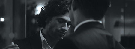
Fig. 1: Top light on coverage for the Under Armour office scene
What you gain with keying from above is the ability to hide units above frame lines, rig without stands in the frame, and you naturally gain ambient light depending on how big and soft you go (Fig. 1).
This also gives you a more dramatic feel than if you killed your overhead unit and threw up something to key right from camera.

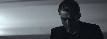
Fig. 2: Keying from the side
For this conference room scene, I put up a Quasar LED tube, wrapped in black wrap to avoid spilling on the walls and windows, with a layer of diffusion, above the two actors (Fig. 2).
This allowed for the single key light to hit both actors in a master, and when we moved in, we didn’t have to move the unit, just reposition actors underneath.
If you were doing something such as an interrogation scene, you could even go harder from above with a bare bulb or some other harder source. On the other hand, if you were doing a sitcom, you would also be keying from above with several soft sources. Keying from above can play in many different scenarios for a range of genres and spaces.
KEYING FROM THE SIDE
Again, key lighting is dictated by the tone of the narrative. The more you understand it, the better your work will be. Side lighting is another dramatic way to key actors. It is important to remember that it is just as much about shadow as it is about light.

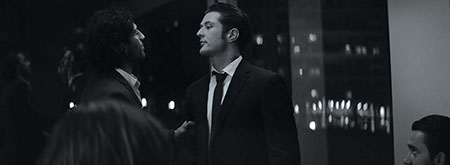
Fig. 3: Top light on a master shot for the office scene
Keying from the side is a great way to create shadow. This approach was taken a lot in this commercial (Fig. 3). I used a mix of a Leko and Arri Skypanel 60-C for a key light throughout the shoot, and would typically start out by having it too close to camera.
After realizing it was a bit too pretty, I would have my crew walk it out more to come from the side. This extends shadows on the face and creates more contrast, which in this commercial is more than appropriate.
Side lighting simply adds texture. Adding shadow creates fall off, where parts of the image gradually transition into black. On a character’s face, this can not only enhance what he or she is feeling or experiencing, but it adds intrigue, guides the audience’s eye and is, overall, much more interesting than a key light that wraps around the whole face.
Flat is ugly. It is also not what we think about when we consider sophisticated cinematography. It is helpful to have choices in terms of what units you use, but it is even more helpful to have options when it comes to shaping and directing them.
You are painting every frame, so making decisions about where to place your lights and what types of shadows you want will help translate your story to the audience. It’s all part of your job to communicate on screen.
Julia Swain is a cinematographer based in California, whose narrative films include “Killing Animals,” “Jilted” and “Cassidy Red.” She continues to shoot on a variety of formats, seeking to create compelling visuals for every story and brand. She can be contacted through TV Technology.
Get the TV Tech Newsletter
The professional video industry's #1 source for news, trends and product and tech information. Sign up below.
