Mis-cued Lighting Cues

You have seen this many times: a fabulous concert performance by a showstopping musical artist. The performance is enhanced with an array of video LED screens programmed to the upper limits of the memory of at least five contemporary media servers. There might even be backup singers, a corps of dancers, and a band of stellar musicians cutting an intricate arrangement—all contributing to this great visual and aural experience. And don't forget pyro. There may even be scenery (although currently this is out of fashion for some unknown reason).
Let us say that this performance is so important that it is being taped by a complement of 20 of the latest HD cameras (in every conceivable location) for later DVD distribution to the fans who could not attend the live concert.
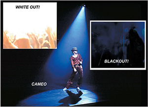
Finally, we are in the last measure of a featured (aren't they all?) song of this musical extravaganza. And what happens? On the last beat of the last measure, programmed to be executed with the same degree of precision as the song's light show is a… blackout! The stage is in darkness although the venue's red exit signs appear to be featured. After what seems like an interminable time, the lighting is restored. The stage does not necessarily return to the previous look of the complete number but maybe to a look that falls into the generic category kindly described as a "home base" look.
CONSIDER A BLACKOUT ALTERNATIVE
All of our 20 cameras have been running continuously in order to record every gem of the performance.

A composite of lighting techniques But days later, we sit in the editing room viewing the end of the number and its blackout on 20 black screens accompanied by thunderous applause. In fairness, there may be some very confusing wide shots within the 20 with the audience lighted and a black hole where the performing stage would be. To me this is a perfect example of an effect that not only doesn't work for television but isn't so red-hot in live performance either. In a forgiving moment I excused this hated cue as it is easy to execute… there is always a prominent button on the lighting console labeled "blackout." No imagination required.
Here's my major gripe. With all the production activity during the performance the performer can be overwhelmed and submerged in a sea of audiovisual technology. In extreme circumstances this embarrassment of riches becomes downright impolite to the talent. In my opinion, the stars are entitled to their moment, when all attention is concentrated upon them. I feel we need an acknowledgment of the artists' individual effort as well as showing our appreciation of their talent.
The solution is so simple I am embarrassed to suggest it. Why not do a blackout of everything but the talent. In other words, reduce the talent to "cameo." This would satisfy the simple goals that I mentioned to concentrate attention on our talent. Take out the audience light (if it is on) to center our attention on the stars even more. After this moment, the lighting can be restored in a relaxed, logical and interesting multistepped manner: (1) limited audience (2) add limited stage (3) basic performance look (4) add full audience and finally, (5) home base stage look. And guess what? There is never a moment of no information for a TV signal.
I am a great believer that when lighting people are struggling to build their bag of tricks and establish a library of styles, there are no demerits for copying. Try to recreate what you observe your mentors and peers using. Just be selective. Executing a blackout because someone else used it is not enough reason to embrace it as a tool. It doesn't really accomplish anything and always comes complete with the original sin of a no-information TV signal (with plenty of audio).
THE WHITEOUT EFFECT
While I'm on a roll, let me introduce the second-worst common lighting cue. Most lighting people will probably have little opportunity to try this cue in its most basic form but, as I will show later on, it also represents an issue of bad practice. I am talking about the "whiteout."
At some moment in our lighting timeline of the concert, we take one or more of our carefully located upstage moving lights and aim them directly at one of our cameras, directly into the lens. Its effect is similar to the explosion of a large land mine or a pyro effect gone awry. Everything on-screen is reduced to an ugly, saturated effect that has elevated all information to maximum system signal level, which becomes a white signal as a result of being clipped by the electronics. It is as devoid of information as in a blackout, but at the opposite end of the brightness scale. Restoration of the picture occurs in a rather awkward manner as the lamps are panned off the lens. To me, this effect is never very pleasing or effective.
In a more subtle form, this effect can be brought in the realm of good practice if we apply it to the subject of background brightness. In the early, simpler times of TV production we would always adhere to the philosophy that no major area's brightness would exceed the brightness of the face and that any area that was brighter than the face would be limited to one stop above.
In more specific terms, this "rule" assumes a perfectly diffuse Lambert surface of 30 percent and 60 percent reflectance respectively. If you departed from this rule the resulting artifacts as "redistribution" that the pickup device created on its own were very disturbing. With the advent of the solid state camera with its limited side-effects and constant improvement of its dynamic range and improvements in display devices as well, the rule is not so rigorous and there is lots of leeway.
AT FACE VALUE
However, we must still compose the placement of the picture elements and their brightness. I guess we could say that this is the "creative process." For example, if we really want a subject to "pop out," there is no better background than black. If we say that the result is not happy enough and we wish a white background, let it be, but choose a brightness that is well within your system's dynamic range that allows the subject's face value to be normally exposed. One stop above face brightness is still a good starting point. In this "white" situation we have to ensure that the costume designer is paying attention as lighting cannot do it all.
What we want to avoid by not over-lighting the background is even the hint of a silhouette or any video edge. Tread carefully, don't push the system to the threshold or… whiteout!
Bill Klages would like to extend an invitation to all the lighting people out there to give him your thoughts atbillklages@roadrunner.com.
The professional video industry's #1 source for news, trends and product and tech information. Sign up below.
