Space, Shape Affect Lighting Techniques
Some cinematographers and lighting technicians can get into a situation troubleshooting a setup and overthink the approach. I find that less is definitely more when it comes to sources in a scene, especially in my type of work, which is most often dramatic narrative.
Lighting does not always have to be motivated, but considering the natural sources in a scene will help dictate the direction and quality of the light, as well as offer ways to extend those effects with other units. Sometimes, there is only one source available in the space, or one single light that is being used or available.
This may feel like an extreme limiter at first, but there are many elegant ways to take a very minimalistic approach with a single source. In fact, a single source can often be the best approach.
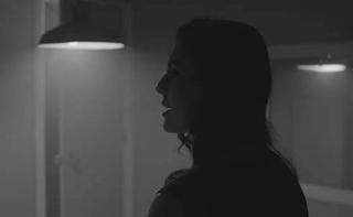
There are countless ways to aim a light with the more space you have. For the music video “Last Criminal” the author decided to light from the smart side, coming at the camera as a backlight, and then returning that as fill.MORE SPACE, MORE OPTIONS
One of the biggest ingredients to good control over lighting is more space. Every step in a lighting setup should be a choice, and when space is limited, so are your choices. There becomes only so many ways you can direct, angle and position a source. Usually, the bigger space, the more options you have. Pulling your subject away from the wall will give you room to cut light off walls, keep shadows off walls and other surfaces, and separate your subject from the background.
There are countless ways to aim a light with the more space you have. More space will also allow you to create more with a single source. For example, you can bounce back the light as fill or as an edge coming from the opposite side. You are able to create more with less.
With one lighting unit in a space that gives you a bit of freedom, two strong strategies come to mind. First is to come from the front, camera side, as a key and pull your subject away from the background. In this instance, stem up on your light to cast shadows down, and keep them off the back wall, if possible.
Another is to light from the smart side, coming at the camera as a backlight, and then returning that as fill. For a music video I shot awhile back, “Last Criminal,” I did just that with a practical in the room. Limited space and mirrors presented some necessary workarounds. Using a hanging lamp with my own incandescent bulb, I was able to control shadow detail and contrast by bouncing the lamp back on the fill side. As a result, I had no stands or units to try and hide either. It became all very simple the more I simplified.
SHAPING A SOURCE
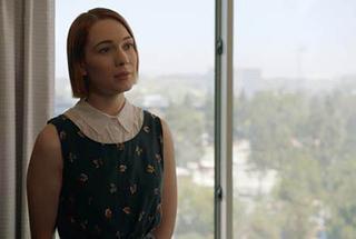
In “Laurels,” a film by David Brundige, a daylight unit could not be used outside a window 11 stories up. In this instance, shooting against the window, the author used an ARRI M8 to bounce back at the actress and shape the natural daylight spilling in. Lighting is all about how you shape a source. Even if it is placing an HMI outside a window, you can choose to be selective with where and how the source hits areas of the space. Often it is helpful to start with a bigger source, and then cut and shape from there, rather than starting with a smaller source that cuts too much as you soften and shape.
In “Laurels,” a film by David Brundige, I could not throw a daylight unit outside a window that was 11 stories up. In this instance, shooting against the window, I used an ARRI M8 to bounce back at our actress and shape the natural daylight spilling in. This also allowed us to be selective about the shape on her face as well as the quality. This could have been accomplished to some degree with a bounce board, and the only true source being the natural daylight.
However, such a punch from the fill side would not have been achieved. With an M8, I was able to expose for what was outside the window as well and justify the unit with the powerful daylight.
If using a single light unit, it is always helpful to have modifiers like flags to shape the beam, cut spill and just be more selective with how the light plays on a subject and in the space itself. Adding negative fill with a solid flag is a favorite technique of mine. Placing flags close to the face on the fill side will allow you to create beautiful shadows and cut any light that is bouncing and creating natural fill from your source.
I believe what separates great cinematographers from the rest is an understanding and skill set when it comes to available light and doing less with more—bouncing light back from a window, placing subjects strategically in a way that allows you to really utilize the window or practical in the space and taking advantage of how much space there is.
We have to remember that a big part of our job is to make a two-dimensional screen feel three-dimensional for our audience, with layers of depth; so being able to do a lot with less will let you make clear decisions between light and shadow. Lighting up the whole frame is not always effective. Instead, try to start with a single source and go from there.
Julia Swain is a cinematographer based in California, whose narrative films include “Killing Animals,” “Jilted” and “Cassidy Red.” She continues to shoot on a variety of formats, seeking to create compelling visuals for every story and brand. She can be contacted throughTV Technology.
Get the TV Tech Newsletter
The professional video industry's #1 source for news, trends and product and tech information. Sign up below.
