TVStudy Options Show Impact on Coverage

Doug Lung
Last month, I showed how the coverage and interference results from the FCC’s TVStudy program change when different input parameters are used. (See “FCC Changes OET-69 Parameters in TVStudy”.)I’ve been playing around with some Python programs that parse data in the tvstudy.cel file and convert it into a color-scaled image that can be displayed on a map. Looking at the results I realized I had the perfect way to show how the use of the different antenna pattern options available in TVStudy impact the predicted signal strength inside a station’s coverage area.
TVStudy outputs data that can be converted into a map, which I described in a previous column, but without changing the color of every individual icon it isn’t easy to display the signal level. Python’s “numpy,” “scipy” and “matplotlib” provide the tools needed to generate the plots.

Table 1: TV Study Parameters (Default parameters used unless noted)
COMPARISON USING DIFFERENT TVSTUDY PARAMETERS
I created three plots for KVEA-TV in Los Angeles using TVStudy with the defaults shown in Table 1. Note that to improve resolution, I used a cell size of 0.2 km and one-second terrain spacing, even though these are not the defaults for either the original OET-69 or the incentive auction Report and Order values. This month’s studies focus only on how using different antenna patterns changes signal strength on the ground.
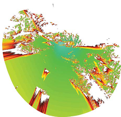
Fig. 1: OET-69 pattern
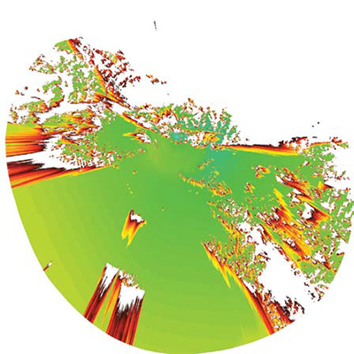
Fig. 2: TVStudy R&O pattern
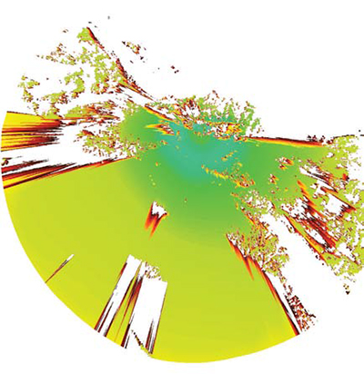
Fig. 3: Actual pattern The first plot (Fig. 1) uses the methods specified for the original OET-69 studies for deriving antenna pattern data from CDBS files. It shows the strongest signal on a high peak west of its Mount Harvard antenna. Notice that the signal drops off evenly. For reference, the shadow to the southwest is from Palos Verdes, and you can see some shadows along the coast north of it as well as the shadow from Catalina beyond Palos Verdes.
The second plot (Fig. 2) used the antenna parameters specified in the incentive auction Report and Order. As you can see, the signal level is down significantly. Using “true geometry” without mechanical tilt, the main beam is above Los Angeles. A broad elevation pattern peak is evident as is reduced signal to the west and increased signal to the east due to the use of the horizontal plane antenna pattern.
The last plot (Fig. 3) is based on the actual antenna azimuth and elevation patterns. From it you can see how the antenna patterns and mechanical beam-tilt were optimized to provide the strongest signal over Los Angeles and the key population areas. You also can see the ripple in the elevation pattern close to the transmitter site.
You can draw your own conclusions on how these variations will impact broadcasters. It is clear interference between stations will change. When a station’s signal level is predicted to be weaker than it really is, the station will have an extra margin of protection from other stations, but will create more interference to other stations. The interference study results from last month’s column illustrate that.
On the other hand, if the impacts on stations are similar, there will be little difference on interference between stations. But if overall predicted signal levels are weaker than reality, stations will have a bit higher margin for protection from wireless services.
I’ve posted copies of the Python programs I used to generate these pictures at www.xmtr.com/RF247 along with the full-resolution versions of the three pictures. By changing the fields used to create the matrix it should be easy to create plots that show what stations are creating interference to a single desired station. Displaying the interference that one station causes to multiple stations is more complex, but should be possible.
You’ll notice the program generates a kmz file, but when I wrote this I wasn’t able to properly geo-reference the images. I may have fixed it by the time this is published, but if not, any suggestions would be appreciated. Processing the tvstudy.cel is complicated because the cell index is in one-second increments while the TVStudy output has significantly lower resolution, even at the 0.2 km cell size I used to create these maps.
Converting tvstudy.cel to an image requires changing the resolution to match that of the output data and I suspect that’s where it is losing the geo-reference.
You’ll find more information in the comments in the files. Please email me with your improvements and suggestions atdlung@transmitter.com.
Get the TV Tech Newsletter
The professional video industry's #1 source for news, trends and product and tech information. Sign up below.
Doug Lung is one of America's foremost authorities on broadcast RF technology. As vice president of Broadcast Technology for NBCUniversal Local, H. Douglas Lung leads NBC and Telemundo-owned stations’ RF and transmission affairs, including microwave, radars, satellite uplinks, and FCC technical filings. Beginning his career in 1976 at KSCI in Los Angeles, Lung has nearly 50 years of experience in broadcast television engineering. Beginning in 1985, he led the engineering department for what was to become the Telemundo network and station group, assisting in the design, construction and installation of the company’s broadcast and cable facilities. Other projects include work on the launch of Hawaii’s first UHF TV station, the rollout and testing of the ATSC mobile-handheld standard, and software development related to the incentive auction TV spectrum repack. A longtime columnist for TV Technology, Doug is also a regular contributor to IEEE Broadcast Technology. He is the recipient of the 2023 NAB Television Engineering Award. He also received a Tech Leadership Award from TV Tech publisher Future plc in 2021 and is a member of the IEEE Broadcast Technology Society and the Society of Broadcast Engineers.
