Where Did All Those People Come From?

Good news! The press conference is very much alive and well. In fact this event has been de rigueur for gathering the media as long as I can remember. Press conferences are usually hastily arranged and staged in a hotel "ballroom" and the chosen site is guaranteed to come complete with a whole list of obstacles that have to be overcome. Supplying the crew with coffee and cold drinks from room service is usually the single most bothersome issue as the expense approaches the bailout cost of AIG.
SHADOW FRIENDS
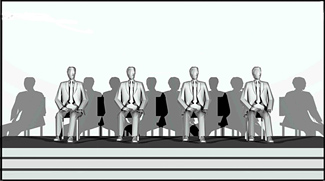
Viewing one of these conferences a month or two ago, I was disappointed with its poor visual quality. The illustrative view in Fig. 1 is rendered to show what I found most disturbing. The conference involved four people on a platform plus eight "friends"in the form of very dense shadows. As is common practice for such events, lighting will claim the four corners of the room as they are generally neutral and undesirable for most other uses.

Fig. 1: Illustrative view of platform at a press conference Since time is a major consideration, the lights are usually mounted on high overhead stands in the claimed corner territories. As a result, the front light for the podium leads to a cross-key situation where the sources are outside the last camera on each end of the platform. This ensures that each of the four subjects is lighted from both sides of each camera's viewpoint. It is impossible to differentiate between the key light and fill light as they are of equal intensity. If you are of an optimistic nature, the close-up results can be best described, kindly, as "acceptable." In my example, the one additional insurmountable obstacle was the reflectance value of the background wall, very close to white, hence the eight additional shadow friends.
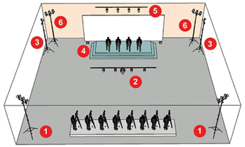
Naturally, attempting to "wash" out these annoying animated blobs would raise the background value to much too high a level. As far as I can recall, these two locations were the only lighting positions used (positions 1 on my bird's eye view in Fig. 2). The actual reason for this minimal complement is not known.

Fig. 2: Bird's eye view of a press conference What to do? Well, the first step is easy. Change the background. Since most of the front illumination falls upon the background in this elemental setup, the reflectance of the background must be at most, one half of a typical subject's face (less than one half of 30 percent or 15 percent). While you are at it, choose a receding as well as a complementary (to flesh) color, which leaves only one choice: blue. As is typical practice, why not do it as a drape in fullness to add some texture? The shadows will now be much lower brightness and the background can actually be lighted to increase the interest and lower the density of the shadows.
In my bird's eye view (Fig. 2) you can make out some added floor striplights that would do just this. However, in the case of a drape in fullness, you might as well slash the drape from the upstage neutral corners. This will not only look nice but will also serve to illustrate your focusing skills. Please recall that up-light streaks were used on the background drape of President Obama's Chicago press conference venue.
I should mention that most press conference situations will usually require long throw instrumentation unless, of course, you are in the White House press room. So, leave those soft-lights at the shop.
BETTER CONDITIONS
Let's discuss a more ideal condition for our press conference. If we are not overjoyed with the unflattering nature of the cross keys, we can throw the schedule into turmoil and hang (by some undetermined means) a center main light (or lights) overhead. A baby 5 KW Fresnel (position 2 in Fig. 2) would be a great choice and provide an even and flattering look. Whether this is actually practical is subject to local conditions and may be impossible to rig and power. Be prepared to experience many howls of dissent that might accompany this suggestion.
It might be easier to suspend a light for each principal. A lot of fun can be had if ellipsoidal units are chosen (as I show on my sketch). Focus and adjustment and matching each unit is an art in itself, but can be very rewarding… as long as no one stands! Hint: After setting the shutters, put Hamburg Frost in each unit rather than defocusing as you would in a theater application.
The room height may be a major consideration in the choice of position. The elevation of the fixture should be about 15 to 20 degrees, a good compromise for flattering modeling for subjects whose facial characteristics are typically unknown. (Note: In the case of a more theatrical production, more elevation might be desired. As a rule in this situation, do not exceed 28 degrees where lamp height is one-half the horizontal projected lamp to subject distance.) Equally undesirable is to make the lamp elevation too flat—starts to look like a scene from "Secrets of the Tomb."
INDIVIDUAL DIMMERS ARE A MUST
As far as fill light is concerned in this setup, many designers choose cross lights left and right as shown in positions 3. Their intensity is same order of magnitude as the center front light(s). If this is too tricky, the lights from position 1 can be decreased in intensity and used to fill in the center front main light(s). Their combined intensity should be no more than 1/3 of main light intensity.
This brings up the subject of dimmer control. Since time for adjustment is a dream and never a reality, save yourself a lot of heartache and put all units on individual dimmers controlled by a small simple console. This will do much to lower your alcohol consumption after the event.
As we have now conquered the room and know how to rig the location, we could add some backlights as shown in position 5 naturally under individual dimmer control. Of course there will probably be a question-and-answer period, so we might as well add some audience lighting from the upstage corners (see positions 6). I show a high overhead stand with a triple header supporting our all time favorite PAR-64 heads. Don't be too concerned if your first choice of beam type is incorrect, it happens to everyone. (Don't forget that triple headers are actually quintuple headers.) Have diffusion ready if smoothness is your thing.
I am still amazed that even the most simple lighting setup will always bring some unique twist that will induce humbleness in even the most experienced and capable designer. So have an open mind and trust your ability and common sense to find your way through the maze.
Bill Klages would like to extend an invitation to all the lighting people out there to give him your thoughts atbillklages@roadrunner.com.
Get the TV Tech Newsletter
The professional video industry's #1 source for news, trends and product and tech information. Sign up below.
